Hello everyone,
I am using StackedColumn3D to display my data.
I keep getting two bars on top of each other because they have the same y-value.
How can I fix this ?
Thanks in advance!
cheers,
Sofien
sofiendami, Member
Hello everyone,
I am using StackedColumn3D to display my data.
I keep getting two bars on top of each other because they have the same y-value.
How can I fix this ?
Thanks in advance!
cheers,
Sofien
myDBR Team, Key Master
X-value in the StackedColumn3D-chart is the series (=label). By definition, the rows with same series goes under same column.
What is it that you are trying to do? How would you like to differentiate the rows with the same series?
--
myDBR Team
sofiendami, Member
I am trying to display a percentage (Y-Axis) for different persons (X-Axis),
I would like for two different persons with the same percentage to be shown in two separat bars.
Thank you for the quick answer !
,Sofien
myDBR Team, Key Master
StackedColumn3D-chart has three dimensions: category value (the x-axis), the series (the ones that gets stacked) and the value for each series.
For example in a chart:
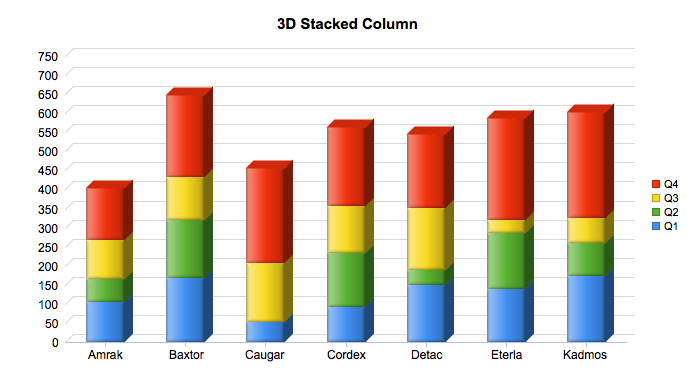
Has name in the x-axis (Amrak, Baxtor...), the are the quarters and the value for each quarter. So, the query is:
[sql]select name, quarter, value
Do you have three dimensions in your data, or just two?
--
myDBR Team
sofiendami, Member
I am actually using the same data twice.
this is my code:
select 'dbr.chart', 'StackedColumn3D', 'Prozent Sollstunden';
select
prozent,
Nutzer,
Prozent
from januar;
But Like I said, I want to display the percentage in my Y-Axis, the value of the percentage to be shown under the chart ( In the X-axis ) and the names on the side. (Last and first name)
My problem is as shown in the image I linked, when two percentages are equal they would be shown on top of each other.
myDBR Team, Key Master
That does not seem to be correct. That would not make sense in terms of a chart.
Maybe you could show a sketch for the chart you would like to see?
--
myDBR Team
sofiendami, Member
sofiendami, Member

sofiendami, Member
myDBR Team, Key Master
Still trying to undestand what the chart is what you would like to get as a result. Your sketch is the same one as the as the original query. Why not use a simple column / bar-chart if you only have two dimensions? What is the purpose of stacking the percentages?
--
myDBR Team
sofiendami, Member

The problem is, if I use a simple Column or bar Chart, use my percentages in the Y-axis and the names in the X-axis. The names will not be shown correctly and it will be overly crowded like in the picture.
What I really would like is to use my percentages to display the chart, which means in the Y-Axis, to show their value under the chart, where the values of the x axis are meant to be and to display the names on the side. What seems to work with a 3D stacked Column. The only issue is when I have two or more persons with the same percentage I get two bars on top of each other and I would like them to be next to each other.
How can I do that ?
myDBR Team, Key Master
Why not simply use a bar chart which autoscales on the Y axis in case the number of users shown vary? See a demo.
if you want something else, draw up a sketch of the thing you want.
--
myDBR Team
sofiendami, Member
Thank you for your help!
I like the demo you sent me as well but how can I choose a different color for each person ?
myDBR Team, Key Master
Usually bar charts are drawn with a single color as (in your case) you already have a separate bar for each person.
If you really want to set separate color for each person, you can use either dbr.chart.color or label_color chart-option.
--
myDBR Team
myDBR Team, Key Master
Usually bar charts are drawn with a single color as (in your case) you already have a separate bar for each person.
If you really want to set separate color for each person, you can use either dbr.chart.color or label_color chart-option.
--
myDBR Team
You must log in to post.