Charts
Commands
dbr.chart - Generates a chart from the subsequent result set
dbr.chart.options - Configures advanced options for the chart
dbr.chart.color - Defines custom colors for chart elements
dbr.chart.gv.option - Configures specific options for Graphviz-based charts
dbr.chart.gv.style - Defines global styles for Graphviz objects
dbr.chart.gv.node - Defines styles for individual Graphviz nodes
dbr.chart.gv.cluster - Defines styles for Graphviz clusters
dbr.chart.gv.engine - Selects the Graphviz layout engine
dbr.chart.gv.renderer_formatter - Overrides default Graphviz renderers and formatters (e.g., cairo:cairo)
dbr.chart.gv.preprocess - Preprocesses the Graphviz data file before rendering
dbr.chart.gv.cmdoptions - Passes custom options directly to the Graphviz renderer command
Syntax
select 'dbr.chart', chart_type, [chart_name [, xSize, ySize]];
select 'dbr.chart.options', option [, value];
select 'dbr.chart.color', hex ARGB color [, hex ARGB color];
select 'dbr.chart.gv.style', 'graph' | 'node' | 'edge' | 'cluster', style_definition;
select 'dbr.chart.gv.node', nodeID, name, style_definition, [clusterID];
select 'dbr.chart.gv.cluster', clusterID, name, style_definition;
select 'dbr.chart.gv.engine', engine;
select 'dbr.chart.gv.renderer_formatter', renderer[:formatter];
select 'dbr.chart.gv.preprocess', 'preprocess_cmd $GV';
select 'dbr.chart.gv.cmdoptions', options;
Syntax Tips
Chart options:
chart_transpose- converts Category and Series in multi-series chartsaxis, x [, y [, y2]]- sets x and y axis name as defined in parameter (select 'dbr.chart.options','axis', 'x-axis', 'y-axis', 'y-axis2')showvalues, 0 | 1 | 'data' | 'total' | 'percent'- shows (1) or hides (0) values in a chart. 'data' shows values in individual data points, 'total' shows values in aggregate, 'percent' shows percentage instead of the valuealternatecolor, color1, color2- sets chart canvas colors ( color1 and color2 )scale, min, max[, step]- sets y-axis min and max values (select 'dbr.chart.options', 'scale', 300, 700)scale2, min, max[, step]- sets 2nd y-axis min and max values (select 'dbr.chart.options', 'scale', 300, 700)scale_x, min, max[, step]- sets x-axis min and max values (select 'dbr.chart.options', 'scale_x', 0, 100)rotateNames, degree- rotates the x-axis names to the degree specifiednumberSuffix, 'suffix'- sets visible suffix for values (use dbr.colstyle for image charts)showLegend, 0- hides legend from multi-series chartfont [,font] [,font_size]- Sets chart font and font size for all chart elements (axis, title, labels, etc.) at onceshading, shading_value [edgeColor[, edgeWidth]]- Pie chart shading value and sector edge definition. Possible shading options: ('LocalGradientShading', 'GlobalGradientShading', 'ConcaveShading', 'RoundedEdgeShading', 'RadialShading', 'FlatShading' and 'RingShading') See more info from ChartDirector documentation.marker series, [marker, [size, [edge_color]]]- Specify a marker type and size used in chart (scatter/line). If the marker_series is null same marker type is used in all series.format, imageformat- Defines the image format (PNG, SVG, GIF, JPG, WMP, BMP, SVGZ)3d, depth[, angle]- Defines 3D depth in pixels (-1=auto, 0=2D, >1 depth in pixels). Optional angle for Pie-chartsautoscale_x [ topExtension [, bottomExtension [, zeroAffinity ]]]- Autoscale the chart x-axis to see differences betterautoscale_y [ topExtension [, bottomExtension [, zeroAffinity ]]]- Autoscale the chart y-axis to see differences betterchart.scale scale_percentage- Scale the chart to the given percentage of the screen. SVG-charts scale best.datetimescale, 1 [, lower_limit, upper_limit [, major_tick_inc, [minor_tick_inc]]]- Treats first column as a datetime and uses datetime scaling on X-axis, optionally setting scaling, major and minor ticks. The lower_limit and upper_limit are datetimes or times and major_tick_inc and minor_tick_inc are seconds.timevalue, 1- Converts the seconds in the data column to a time value, allowing times >24h to be displayed in the chartcartesian- use cartesian coordinate system in the chartaxis_noscale, 1/0- Do not sync x- and y-axis on cartesian chartsnumberscale- Use numeric scaling for the axisbackground_color, color- Set chart background coloredge_color, color- Set chart's edge colorplot_edge_color, color- Set plot's edge colorgrid_color_horizontal, color- Set chart's horizontal grid colorgrid_color_vertical, color- Set chart's vertical grid colorraised_effect, raised- Set edge raise in pixelstitle_font, font- Set title fonttitle_font_size, size- Set title font sizetitle_color, color- Set title colortitle.wrap, character_count[, cut]- Wraps title text to defined character length. Word-wrap when cut is not defined. if cut==1, cut long wordsaxis_font, font- Set axis fontaxis_font_size, size- Set axis font sizeaxis_color, color- Set axis colorfix_y_axis, 1- Set y-axis alignment to right to fix SVG chart text spacing when font spacing is not correct in ChartDirectorx_axis_max_width, width- Set maximum length of x axis in a XY-charty_axis_max_width, width- Set maximum length of x axis in a XY-chartz_axis_max_width, width- Set maximum length of x axis in a XY-chartx2_axis.show, 1- Show the second x-axisx_axis_margin, margin- Add extra margin at the ends of the x-axisx2_axis_margin, margin- Add extra margin at the ends of the second x-axisx_axis_color, color- Set x-axis colory_axis_color, color- Set y-axis colorx2_axis_color, color- Set x2-axis colory_axis_color, color- Set y-axis colorz_axis_color, color- Set z-axis colory2_axis_color, color- Set y2-axis colorx_axis_font_color, color- Set x-axis font colory_axis_font_color, color- Set y-axis font colorx2_axis_font_color, color- Set x2-axis font colory2_axis_font_color, color- Set y2-axis font colorz_axis_font_color, color- Set z-axis font colory_axis_label_style, colstyle- Set style for y-axis labelsy2_axis_label_style, colstyle- Set style for y2-axis labelsx_axis_tick_middle, 1 | 0- Define if tick-marks are placed in middle of title in x-axispadding_top, padding- Set top padding in pixelspadding_left, padding- Set left padding in pixelspadding_bottom, padding- Set bottom padding in pixelspadding_right, padding- Set right padding in pixelstitle.align, 'left' | 'chart'- Align chart title to left of chart/middle of chart instead of the default middle of plot areahide 'all | ('bg', 'yaxis', 'xaxis', 'grid')- Hide parts of the chart: all (show just the chart, bg=plot area background, x-axis, y-axis, grid)radius, radius- Set pie/funnel radius in pixelslabel_font, font- Set label fontlabel_font_size, size- Set label font sizelabel_font_color, color- Set label colorlabel_font_weight, 'normal' | 'bold'- Set label weight in Chart.js's datalabels pluginlabel_font_anchor, 'center' | 'start' | 'end'- Set label weight in Chart.js's datalabels pluginlabel_data_font, font- Set label font for multiseries datalabel_data_font_size, size- Set label font size for multiseries datalabel_data_font_color, color- Set label color for multiseries datalabel.max.width, width- Set maximum width for pie/donut chart labelsexplode, label, pixels- Separate pie/donut section from the chartlabel.align, alignment- Set label alignment (bottomleft, bottomcenter, bottomright, left, center, right, topleft, topcenter, topright, bottom, top, topleft2, topright2, bottomleft2, bottomright2)label_color, label, color- Allows you to define a color based on a label name (XY-charts) or based on the series name (multi-series charts)legend.padding, px- Adds padding between legend and Radar- and Polar-chartsradius.zoom, percentage- Zooms the Radar- and Polar-chart's radius for better fitlabel.wrap, character_count[, cut]- Wraps label text to defined character length. Word-wrap when cut is not defined. if cut==1, cut long wordslegend.columns, column_nbr- Sets number of legends to uselegend_font, font- Set legend fontlegend_font_size, size- Set legend font sizelegend_color, color- Set legend colorlegend.position, 'left' | 'right' | 'top' | 'bottom'- Set legend positionlegend.style, 'background_color', 'edge_color', 'rounded_border[TL]', ['rounded_borderTR', 'rounded_borderBR', 'rounded_borderBL']- Set legend stylelegend_reverse, 1- Reverse the legend orderline_width, width [, label]- Line width in line chart. Optionally selecting the labelline.style[ series_name,] 'dash' | 'dot' | 'dotdash' | 'altdash'- Line style. series_name is required in multiseries chart.bargap, 0..1- Controls the gap between columns. Value is percentage <=1 (negative value overlaps).subbargap, 0..1- Controls the gap between individual columns in multiseries column chart. Value is percentage <=1 (negative value overlaps).width_per_item, width- When chart width is set to 'auto', this option determines the width for each itemheight_per_item, width- When chart height is set to 'auto', this option determines the height_per_item for each itemexport_as_png, 1/0- When exporting an SVG chart, determines whether the chart is drawn as PNG (some wkhtmltopdf versions may render some charts poorly). A global option for this exists indefaults.php.softlightning, 1/0- Determines if softlightning is used on charts.series, 'series1' [, 'series2' [, 'series3'..,]]- Defines the series order in multiseries chartcategory_order, 'category1' [, 'category2' [, 'category3'..,]]- Defines the category display order in multiseries charts.category_sort, 'string', 'numeric' | 'natural'- Set category display sorting ordermark, value, color, width, [, 'text' [, text_angle]]- Add a mark line to a XY-charttarget, color, width in px, height (0-1)- Add a target mark for bar and column charts (3rd data column)series_axis, series_name, 1 | 2- Choose the axis for the series in double Y-axis charts.InnerRing, size- Meter-chart inner ring proportional sizeOuterRing, size- Meter-chart outer ring proportional sizeskip_null_values, 0- By default, the report's NULL values in charts are treated as missing values. If this option is turned on, they are treated as zeros.allow_gaps, 1- If the option is turned on, missing values (or values containing NULL) are drawn into a line chart allowing gaps to appear to the line(s). This option turns the markers in the line on by default in order to show values that appear between two missing values. See 'marker'-option how to specify the marker.tooltip, '[ColumnReference] [ColumnReference]'- Define the mouse tooltip content with the ability to refer to data columnstooltip_y2, '[ColumnReference] [ColumnReference]'- Define the mouse tooltip content for the values in the second y-axistooltip_animate, 1/0- Allows disabling tooltip animationxy_plot_fill, 1/0- Use full chart area for the plot area and hide the axistrendline, line_color[, title, line_width [, SeriesName], [regression_type [,regression_degree]]]- Adds a trendline to the chart (line, column, bar)gantt.scale, days- Scale of the chart. Use 30 for a monthgantt.start, date- If specified, marks the start date for the chart. If not, the first date in data is usedgantt.end, date- If specified, marks the end date for the chart. If not, the last date in data is usedgantt.baseline, label, start, end- Sets the baseline for a labelgantt.baseline_text, text- Baseline text, if not specified 'Baseline' is used if baselines are definedgantt.baseline_pattern.border, color- Baseline marker's border colorgantt.baseline_pattern.color, color- Baseline marker's background colorgantt.baseline_pattern.width, px- Baseline marker's widthgantt.baseline_pattern.height, px- Baseline marker's heightgantt.dateline, day- Extra date linegantt.label.height, px- Height of the gantt labelsgantt.single_label, 1- Use just one row / labelgantt.start_of_day_format, chartdirector_date_format- ChartDirector date format for day ganttgantt.start_of_hour_format, chartdirector_time_format- ChartDirector time format for hour ganttgantt.start_of_month_format, chartdirector_date_format- ChartDirector date format for day gantt when month changesscale, minimum, maximum, step- Y-Axis scale, If 'auto', scales x and y-axis equally in bubble-chartscale2, minimum, maximum, step- 2nd Y-Axis scaleequal_scale_dy, 1/0- Control scaling of Y-axis on DoubleY chartsbubble.scale, 'x'|'y'|'pixel'- Individual bubble size relative to y-axis, x-axis or pixels.bubble.transparency, 30- Bubble transparency to show overlapping bubblesmeter.text, text- Optional text shown in a meter-chart.meter.text.font, font- Text font (default is arial)meter.text.size, size- Text size (default is 8)meter.text.color, color- Text color (default is black)linearmeter.orientation, 'horizontal'|'vertical'- Linearmeter orientation. Default is horizontal.linearmeter.zone, from, to, color- By default, the zones are 0-33 green, 33-66 yellow and 66-100 red. With this option, you can define your own zones.linearmeter.height, height- Linearmeter height in pixels, default is 20 pixels.linearmeter.width, width- Same as linearmeter heightlinearmeter.text, text- Optional text shown in linearmeter.linearmeter.text.font, font- Text font (default is arial)linearmeter.text.size, size- Text size (default is 8)linearmeter.text.color, color- Text color (default is black)linearmeter.pointer.color, color- Pointer colormeter.theme, theme- Select the meter theme ('black', 'white', 'default')meter.title.font, font- Set meter title fontmeter.title.size, size- Set meter title font sizemeter.title.color, color- Set meter title font color ('0xFF0000')meter.text, text- Set the meter textmeter.text.font, font- Set meter text fontmeter.text.size, size- Set meter text font sizemeter.text.color, color- Set meter text font color ('0xFF0000')meter.label.font, font- Set meter label fontmeter.label.size, size- Set meter label font sizemeter.label.color, color- Set meter label font color ('0xFF0000')meter.pointer.color, color- Set meter pointer color ('0xFF0000')meter.color.type, 'step' | 'gradient'- Select if the meter colors are individual (steps) or gradient (the default)meter.color.step, step, color- Define step colorsmeter.color.gradient, step, color- Define gradient colorspolar.grid, axis_color, axis_width, polar_color, polar_width,- Define chart colors for polarscatter-chartzone, from_value, to_value, color- Set background color for zones, range of valuesdonut.size size- Donut thicknessdonut.orientation 1/-1- Donut rotation clockwise / counterclockwisedonut.text text- Donut textdonut.font.size- Font sizedonut.font.name- Font namedonut.font.color- Font colordonutpercent.orientation 1/-1- DonutPercent chart orientation. 1=clockwise, -1 anticlockwisedonutpercent.size size- Donut thicknessdonutpercent.text text- Text inside the donutdonutpercent.font.name font- Font for the text inside the donutdonutpercent.font.size size- Font size for the text inside the donutdonutpercent.font.color color- Font color for the text inside the donutsemidonutpercent.size size- Donut thicknesssemidonutpercent.text text- Text inside the donutsemidonutpercent.font.name font- Font for the text inside the donutsemidonutpercent.font.size size- Font size for the text inside the donutsemidonutpercent.font.color color- Font color for the text inside the donutscatter3d.x_axis_labels label- Replace x-axis numbers with a text labelscatter3d.y_axis_labels label- Replace y-axis numbers with a text labelscatter3d.z_axis_labels label- Replace z-axis numbers with a text labelscatter3d.drop_line Series | null, color | null, 'dash' | 'dot' | 'dotdash' | 'altdash'- Define marker and the drop line type for the data pointscatter3d.plot_area center_x, center_y, xwidth, ydepth, zheight- Manually define the plot areascatter3d.view_angle elevation, rotation- Set the orientation of the chart in degreesscatter3d.wall_color xy_color, yz_color, zx_color, border_color- Define charts wall colorsscatter3d.z-legend 1- Use single gradient legend for MSScatter3d chart instead of separate series legends
Where:
-
topExtension
The top portion of the axis that no data point should fall into. For example, a value of 0.1 means no data value will fall within the top 20% of the axis. The topExtension must be between 0 to 1. Default is 0.1. -
bottomExtension
The bottom portion of the axis that no data point should fall into. For example, a value of 0.1 means no data value will fall within the bottom 20% of the axis. The bottomExtension must be between 0 to 1. -
zeroAffinity
ChartDirector will determine that it is "unreasonable" to use 0 as the axis starting point if the data fluctuation (the difference between the maximum and minimum data values) is too small compared with the data value. ChartDirector tests the "too small" condition using the formula: maxDataValue * zeroAffinity < minDataValue. The default value is 0.5 -
regression_type Sets the regression type to be used. Available regression types are: LinearRegression (default), ExponentialRegression, LogarithmicRegression, or PolynomialRegression. In the case of PolynomialRegression, regression_degree must be defined.
-
regression_degree
PolynomialRegression's degree. -
Donut vs Doughnut
For compatibility reasons, you can use both 'donut.' or 'doughnut.' syntaxes.
Image Chart Options
Formatting Labels
Image chart's labels can be formatted using the normal 'dbr.colstyle' command (CSS is not supported). 'dbr.colstyle' also accepts ChartDirector's parameter substitution and formatting and ChartDirector Mark Up Language with dbr.colstyle. The style-string can contain:
- printf-format for the value
- Any free text
- ColumnReferences to get value from another column
- ChartDirector's Parameter Substitution Strings and Mark Up Language
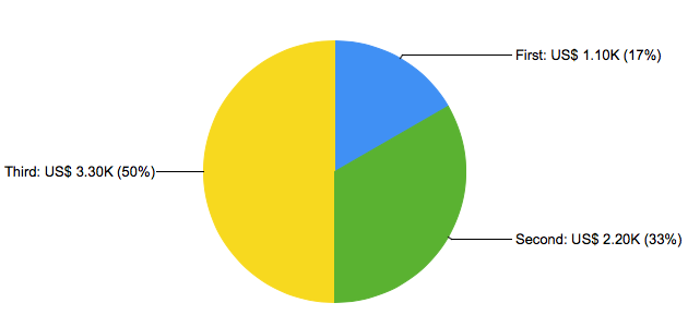
In the example, the style string includes a column reference ('[name]'), a value printf ('%.2f'), and a ChartDirector's parameter substitution string ({percent|0}).
select 'dbr.chart', 'pie';
select 'dbr.colstyle', 'value', '[name]: US$ %.2fK ({percent|0}%)';

select 'First' as 'name', 1.1 as 'value'
union
select 'Second', 2.2
union
select 'Third', 3.3;
Multiple Options
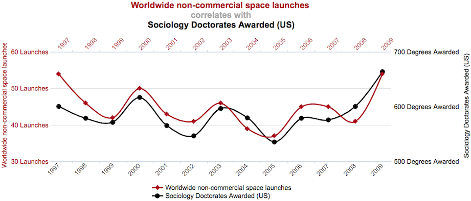
The example shows multiple options applied to the chart:
declare v_s varchar(80);
declare v_w varchar(80);
declare v_color1 varchar(10);
declare v_color2 varchar(10);

set v_s = 'Sociology Doctorates Awarded (US)';
set v_w = 'Worldwide non-commercial space launches';

set v_color1 = '0xA9001D';
set v_color2 = '0x000000';

select 'dbr.title', '';
select 'dbr.chart', 'mssplineDY', concat('<*size=16,color=A9001D*>', v_w, '\n<*color=AAAAAA*>correlates with\n<*color=000000*>', v_s), 1200, 500;
select 'dbr.chart.options', 'font', 12;

select 'dbr.chart.options', 'scale', 30, 60, 10;
select 'dbr.chart.options', 'scale2', 500, 700, 100;
select 'dbr.chart.options', 'rotateNames', 45;

select 'dbr.chart.color', v_color1, v_color2;
select 'dbr.chart.options', 'marker', v_w, 'DiamondShape', 12, v_color1;
select 'dbr.chart.options', 'marker', v_s, 'CircleShape', 12, v_color2;
select 'dbr.chart.options', 'x2_axis.show', 1;

select 'dbr.chart.options', 'x_axis_margin', 20;
select 'dbr.chart.options', 'x2_axis_margin', 20;

select 'dbr.chart.options', 'y_axis_font_color', v_color1;
select 'dbr.chart.options', 'x2_axis_font_color', v_color1;

select 'dbr.chart.options', 'y_axis_label_style', '%d Launches';
select 'dbr.chart.options', 'y2_axis_label_style', '%d Degrees Awarded';

select 'dbr.chart.options', 'axis', '', v_w, v_s;

select 'dbr.chart.options', 'legend', 1;
select 'dbr.chart.options', 'legend.position', 'bottom';
select 'dbr.chart.options', 'legend.columns', 1;

select 'dbr.chart.options', 'tooltip', '[sw]: [v]';

select y, sw, v
from mydb.mydata;
ChartDirector Native Options
ChartDirector offers a variety of options for chart formatting. ChartDirector is implemented using PHP class directives, and for native commands, myDBR offers direct access to myDBR's ChartDirector chart object ($c), the layer object ($layer), and the trend layers array ($trend_layers). Commands are passed as PHP code snippets using the 'dbr.chart.options', 'chartdirector' command.
select 'dbr.chart.options', 'chartdirector', '\$c-\>chartdirectorcommand';
In the example, we'll change the y-axis to logarithmic and set minimum and maximum values, display only every second x-axis label, set the border and background to gray, and finally display a drop shadow for the chart.
select 'dbr.chart', 'Line', 'Chart';

select 'dbr.chart.options','rotateNames', 90;
select 'dbr.chart.options','showvalues', 0;
select 'dbr.chart.options','chartdirector', '$c->yAxis->setLogScale(300,700);$c->xAxis->setLabelStep(2);';
select 'dbr.chart.options','chartdirector', '$c->setBorder(0xEEEEEE);$c->setBackground(0xeeeeee);$c->setDropShadow();';

select Name, sum(Items)
from mydb.TestTable
where year(InsertDate)=2008
group by Name;
For a full description of ChartDirector's class library, see the ChartDirector documentation.
If you have multiple charts and wish to keep the same colors between different charts, you can define colors based on labels (or series). If you use the same color for the same labels in many places, it is easier to create a helper procedure so your definitions can be found in one place.
You can also leave out the optional color definition. If one is not set, the color is defined from the normal color set.
select 'dbr.chart.options', 'label_color', 'Q1', '0x006F00';
select 'dbr.chart.options', 'label_color', 'Q2', '0xFF66CC';
select 'dbr.chart.options', 'label_color', 'Q3', '0x9900FF';
select 'dbr.chart.options', 'label_color', 'Q4', '0x99FFCC';

select 'dbr.chart', 'mscolumn';

select Name, Quarter, sum(Items)
from mydb.TestTable
group by Name, Quarter;

select 'dbr.chart.options', 'label_color', 'Q1', '0x006F00';
select 'dbr.chart.options', 'label_color', 'Q2', '0xFF66CC';
select 'dbr.chart.options', 'label_color', 'Q3', '0x9900FF';
select 'dbr.chart.options', 'label_color', 'Q4', '0x99FFCC';

select 'dbr.chart', 'Column';

select Quarter, sum(Items)
from mydb.TestTable
group by Quarter;
Markers
For scatter charts, you can select a different marker for each category.
select 'dbr.chart.options', 'marker', 'category_name', \['Marker'\[, size\]\];

Markers available starting from left bottom:
- CircleShape
- GlassSphereShape
- GlassSphere2Shape
- SolidSphereShape
- SquareShape
- DiamondShape
- TriangleShape
- RightTriangleShape
- LeftTriangleShape
- InvertedTriangleShape
- StarShape(3)
- StarShape(4)
- StarShape(5)
- StarShape(6)
- StarShape(7)
- StarShape(8)
- StarShape(9)
- StarShape(10)
- PolygonShape(5)
- Polygon2Shape(5)
- PolygonShape(6)
- Polygon2Shape(6)
- CrossShape(0.1)
- CrossShape(0.2)
- CrossShape(0.3)
- CrossShape(0.4)
- CrossShape(0.5)
- CrossShape(0.6)
- CrossShape(0.7)
- Cross2Shape(0.1)
- Cross2Shape(0.2)
- Cross2Shape(0.3)
- Cross2Shape(0.4)
- Cross2Shape(0.5)
- Cross2Shape(0.6)
- Cross2Shape(0.7)
Some markers have parameters which alter the marker appearance.
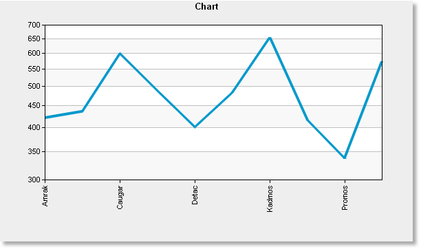
select 'dbr.chart', 'scatter';
select 'dbr.chart.options', 'marker', 'Amrak', 'TriangleShape', 12;
select 'dbr.chart.options', 'marker', 'Baxtor', 'InvertedTriangleShape';
select 'dbr.chart.options', 'marker', 'Detac', 'SquareShape';

select category, x, y
from mydb.mydata
order by category;
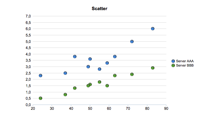
Chart Value Formatting
You can use the normal 'dbr.colstyle'-command to format the image chart values.
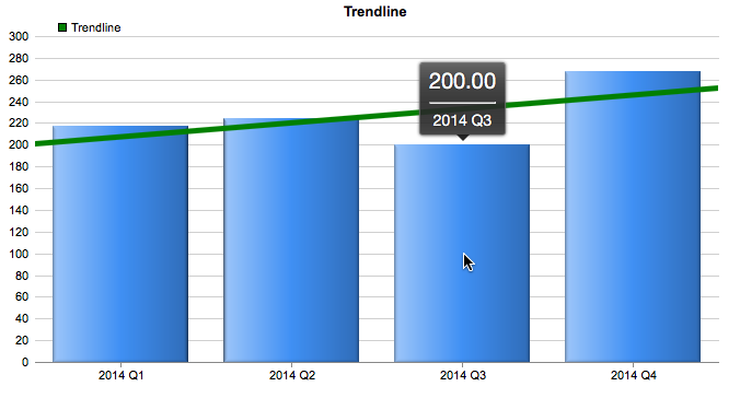
Simple Trendline
A trendline can be added to XY and scatter charts using trendline-options.
select 'dbr.chart', 'Column', 'Trendline';

select 'dbr.chart.options', 'trendline', '0x008000' , 'Trendline', 5;
/* Add a legend to the trendline */
select 'dbr.chart.options', 'chartdirector','$legendObj = $c->addLegend(50, 8, false, "", 8)->setBackground(Transparent);';

select supplier, sum(items)
from mydata
group by supplier;
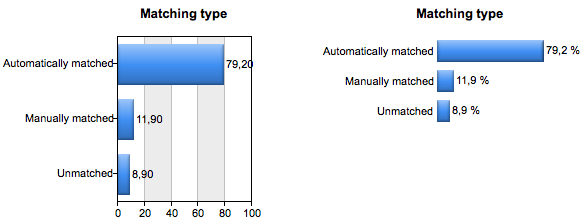
Hiding Chart Elements
You can hide parts of the chart with the 'hide' option. In the example, we'll hide the plot background, both axes, and the grid to create a cleaner-looking chart with the label showing the value.
select 'dbr.chart', 'bar', 'Matching type', 300, 'auto';
select 'dbr.colstyle', 2, '%.1f %';

-- Hide background, both axis and the grid
select 'dbr.chart.options', 'hide', 'bg,yaxis,xaxis,grid';
-- Title aligned to center of chart (instead of plot area)
select 'dbr.chart.options', 'title.align', 'chart';
select 'dbr.chart.options', 'height_per_item', 30;

select 'Automatically matched', 79.2
union
select 'Manually matched', 11.9
union
select 'Unmatched', 8.9;
The result is shown on the right. The same chart without the options is shown on the left.
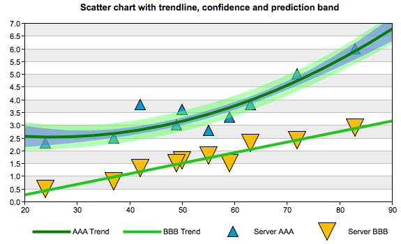
Curve Fitting with Confidence Band and Prediction Band
The ChartDirector option has a variable $trend_layers that can be used to add functionality to a trendline. In the example, Confidence Band and Prediction Band are added.
select 'dbr.chart', 'scatter', 'Scatter chart with trendline, confidence and prediction band';
select 'dbr.chart.options', 'marker', 'Server AAA', 'TriangleShape', 16;
select 'dbr.chart.options', 'marker', 'Server BBB', 'InvertedTriangleShape', 26;

select 'dbr.chart.options', 'trendline', '0x008000', 'AAA Trend', 4, 'Server AAA';
select 'dbr.chart.options', 'trendline', '0x1EC41B', 'BBB Trend', 4, 'Server BBB';

select 'dbr.chart.options', 'chartdirector',
'$trend_layers[0]->addConfidenceBand(0.5, 0x806666ff);
$trend_layers[0]->addPredictionBand(0.5, 0x8066ff66);
$trend_layers[0]->setRegressionType(PolynomialRegression(2));';

select server, x, y
from mydata;
Charting Modules
myDBR allows you to create charts based on the result set. myDBR supports multiple charting modules with different capabilities:
-
ChartDirector (from Advanced Software Engineering) offers advanced charting options.

-
With Graphviz support, myDBR is able to draw complex network and hierarchical reports. The charts generated with the Graphviz module can also output the source code for the chart to be processed with external charting applications that support Graphviz's underlying charting language.
-
With Chart.js support, myDBR is able to display flexible, animated, interactive, and responsive charts. This is available in the OEM version.
Charts can be divided into four categories:
- XY charts (XY), where the data set consists of X-values (categories) and Y-values (data).
- Multi-series charts (MS), where the data set consists of X-values (categories) and multiple data values (Y's).
- Meter charts (Meter), where the data set consists of a single meter value.
- Network charts (Network), where the data set consists of parent-child or node-node pairs.
- Other charts.
Chart Types
| Chart type | Command | Type | Example | Image Charts (ChartDirector) | Chart.js | Graphviz |
|---|---|---|---|---|---|---|
| Column | Column | XY |  | Yes | Yes | |
| 3D Column | Column3d | XY | 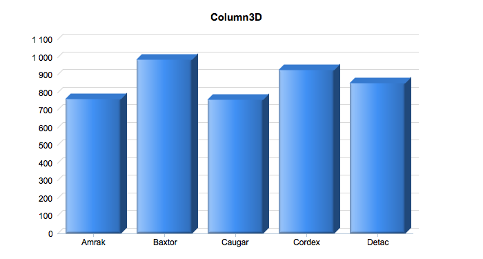 | Yes | ||
| Multi-Series column | MSColumn | MS | 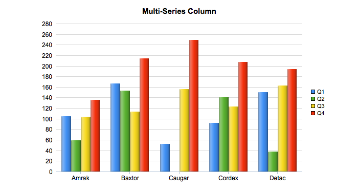 | Yes | Yes | |
| 3D Multi-Series column | MSColumn3D | MS | 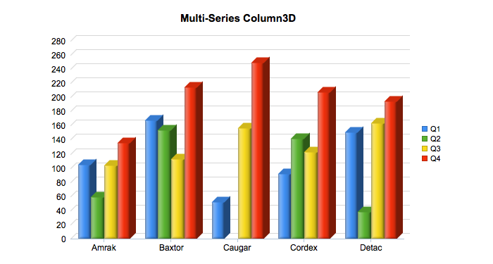 | Yes | ||
| Stacked Column | StackedColumn | MS | 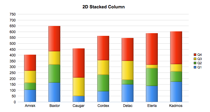 | Yes | Yes | |
| 3D Stacked Column | StackedColumn3D | MS | 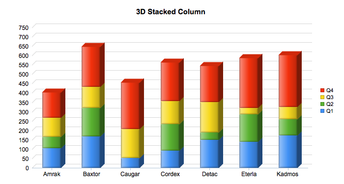 | Yes | ||
| Stacked Bar | StackedBar | MS | 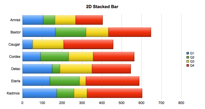 | Yes | Yes | |
| 3D Stacked Bar | StackedBar3D | MS | 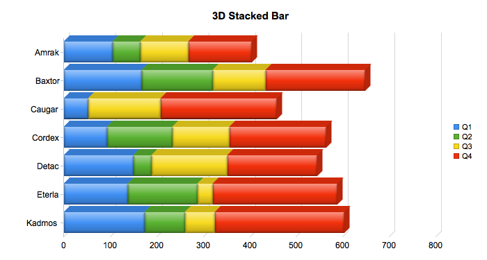 | Yes | ||
| Stacked Area | StackedArea | MS | 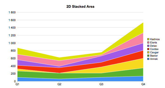 | Yes | Yes | |
| 3D Stacked Area | StackedArea3D | MS |  | Yes | ||
| Line | Line | XY |  | Yes | Yes | |
| 3D line | Line3D | XY |  | Yes | ||
| Multi-Series Line | MSLine | MS |  | Yes | Yes | |
| Multi-Series Line Double Y | MSLineDY | MS | 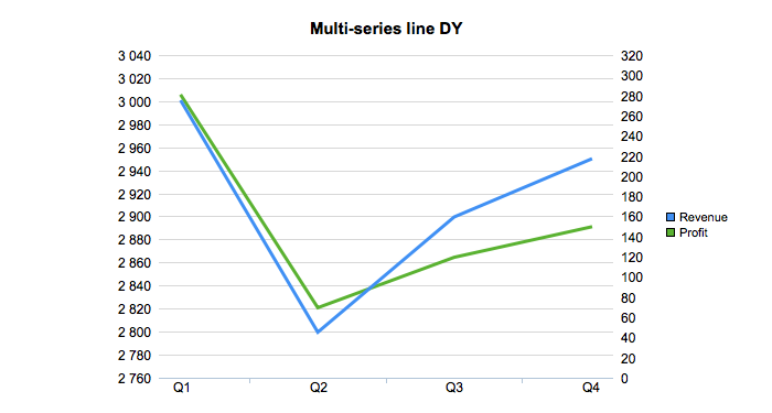 | Yes | ||
| Multi-Series Line Double Y 3D | MSLineDY3D | MS |  | Yes | ||
| Spline | Spline | XY | 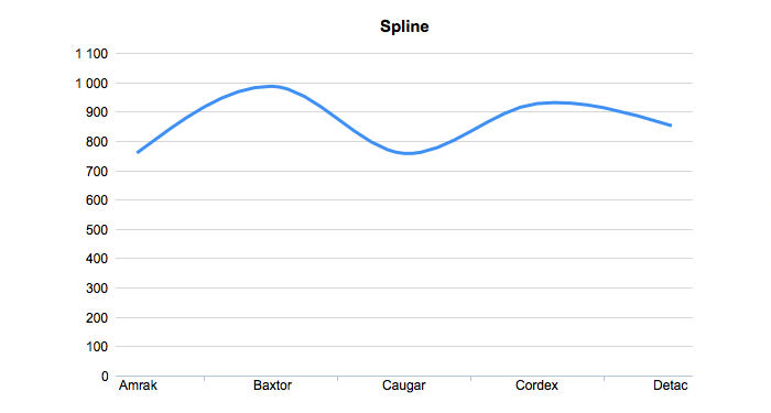 | Yes | Yes | |
| Multi-Series Spline | MSSpline | MS | 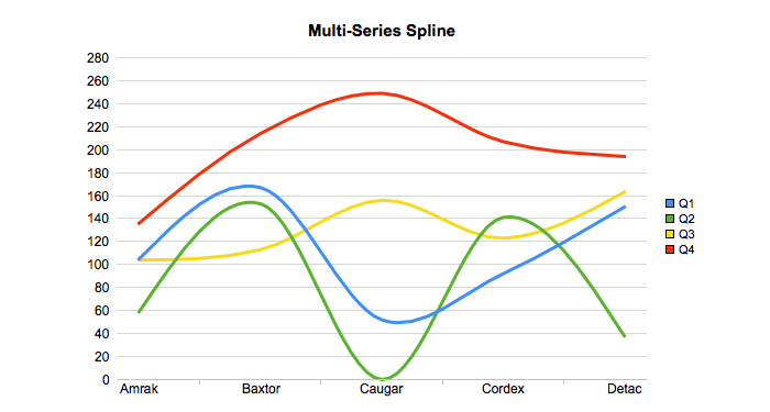 | Yes | Yes | |
| Stepline | Stepline | XY | 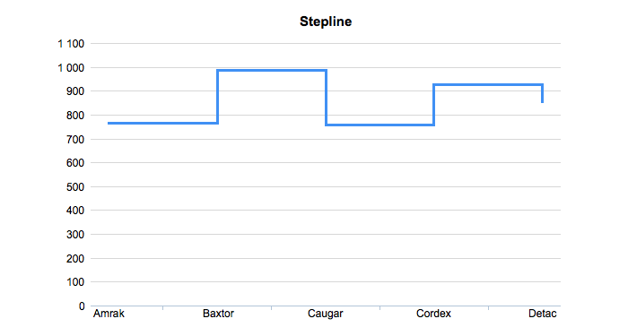 | Yes | ||
| Multi-Series Stepline | MSStepline | MS | 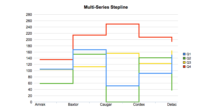 | Yes | ||
| Pie | Pie | XY | 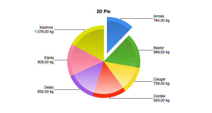 | Yes | Yes | |
| 3D Pie | Pie3D | XY | 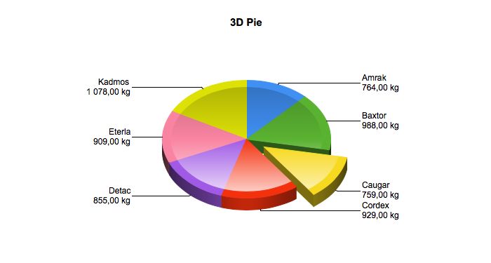 | Yes | ||
| Bar | Bar | XY | 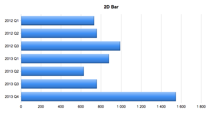 | Yes | Yes | |
| 3D Bar | Bar3D | XY | 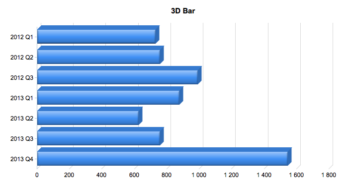 | Yes | ||
| Multi-Series Bar | MSBar | MS | 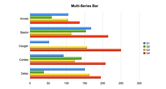 | Yes | Yes | |
| Area | Area | XY | 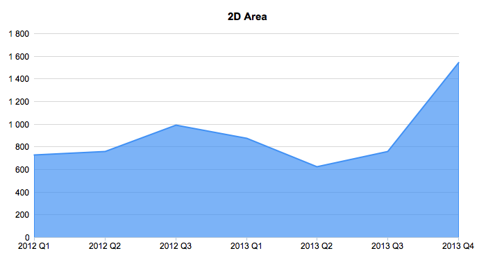 | Yes | Yes | |
| 3D Area | Area3D | XY | 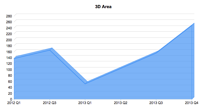 | Yes | ||
| Bubble | Bubble | XY | 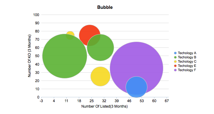 | Yes | ||
| 3D Bubble | Bubble3D | XY |  | Yes | ||
| Multi-Series Area | MSArea | MS | 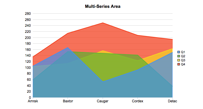 | Yes | ||
| Percent Column | Percentcolumn | MS | 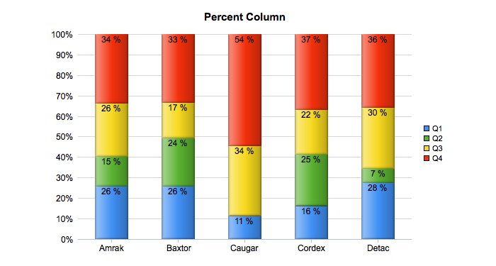 | Yes | ||
| Percent Bar | Percentbar | MS |  | Yes | ||
| Percent Area | Percentarea | MS |  | Yes | ||
| Donut | Donut (or Doughnut) | XY |  | Yes | Yes | |
| 3D Donut | Donut3D (or Doughnut3D) | XY |  | Yes | ||
| Scatter | Scatter | XY |  | Yes | Yes | |
| Scatter Line | ScatterLine | XY | 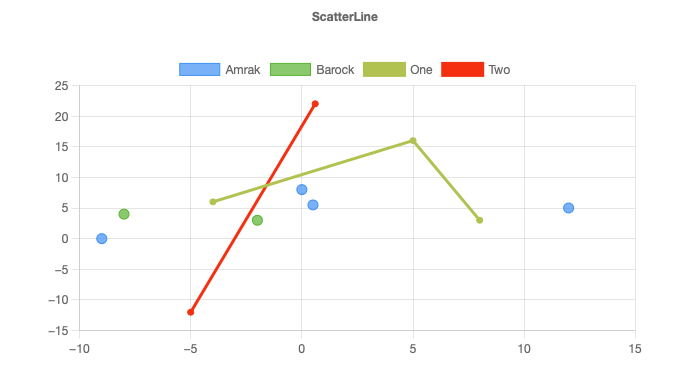 | Yes | Yes | |
| Pyramid | Pyramid | XY |  | Yes | ||
| Pyramid 3D | Pyramid3D | XY |  | Yes | ||
| Cone | Cone | XY |  | Yes | ||
| Cone 3D | Cone3D | XY | 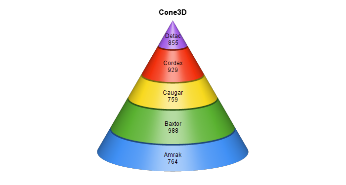 | Yes | ||
| Funnel | Funnel | XY | 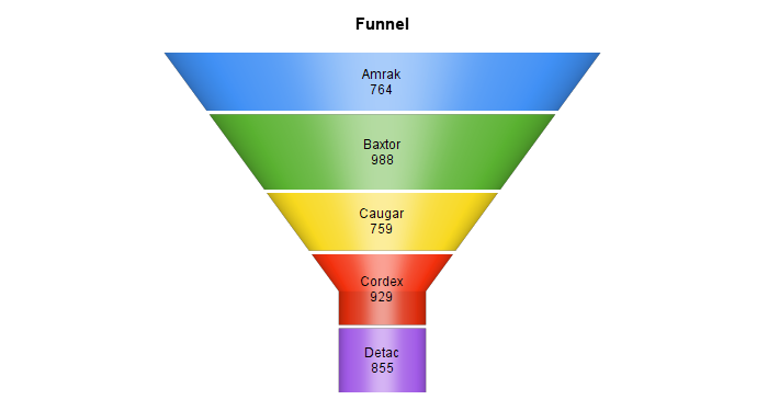 | Yes | ||
| Funnel 3D | Funnel3D | XY | 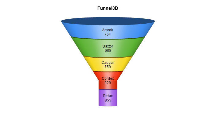 | Yes | ||
| Multi-Series Column Double Y | MSColumnDY | MS | 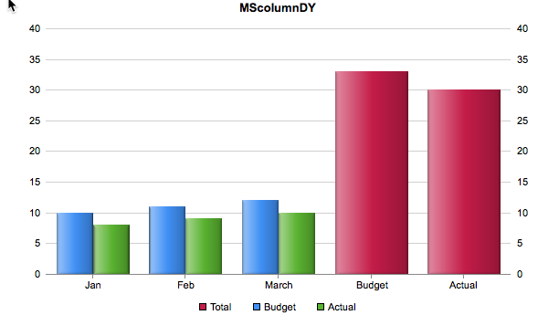 | Yes | ||
| Multi-Series Column Double Y 3D | MSColumnDY3D | MS | 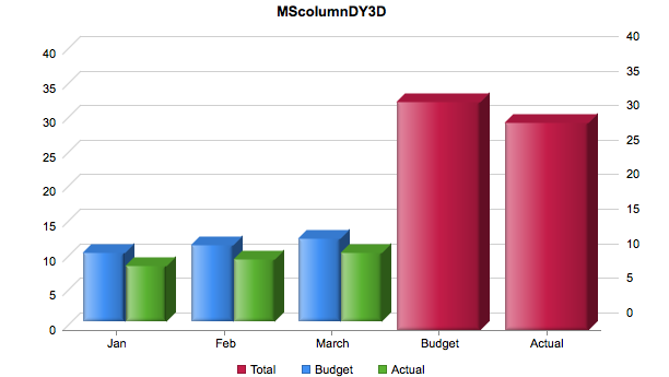 | Yes | ||
| Multi-Series Column Line Double Y | MSColumnLineDY | MS | 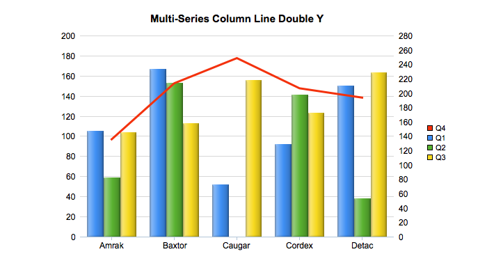 | Yes | ||
| Multi-Series Column Line Double Y 3D | MSColumnLineDY3D | MS | 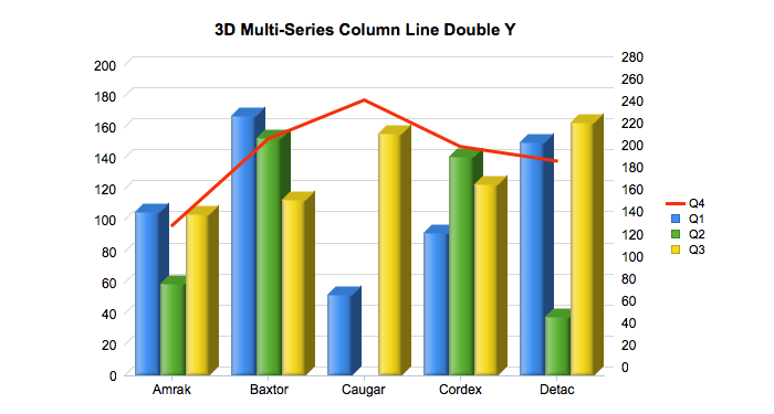 | Yes | ||
| Multi-Series Column Spline Double Y | MSColumnSplineDY | MS | 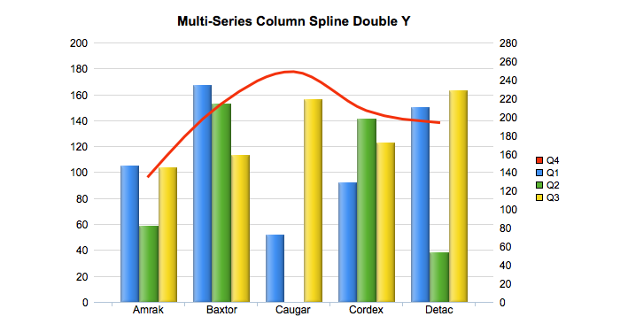 | Yes | ||
| Multi-Series Column Spline Double Y 3D | MSColumnSplineDY3D | MS | 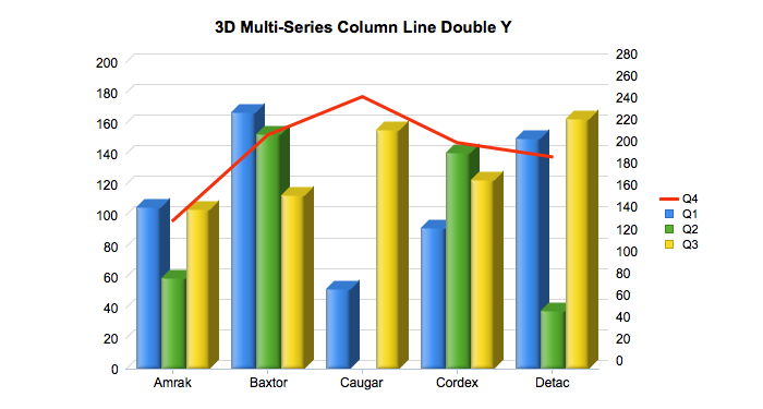 | Yes | ||
| Meter | Meter | Meter | 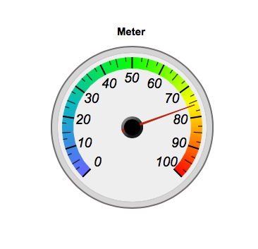 | Yes | ||
| Linear meter | Linearmeter | Meter | 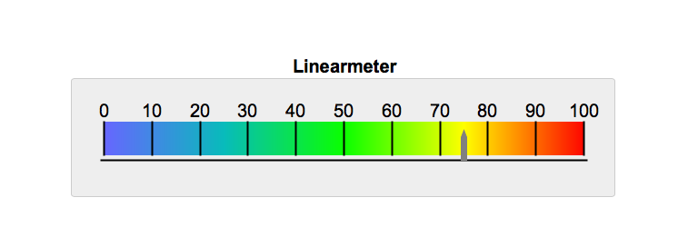 | Yes | ||
| Semicircle | Semicircle | Meter | 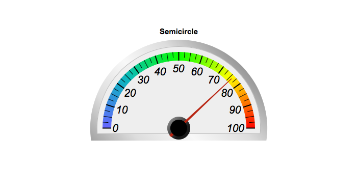 | Yes | ||
| Rectangular meter | Rectangularmeter | Meter | 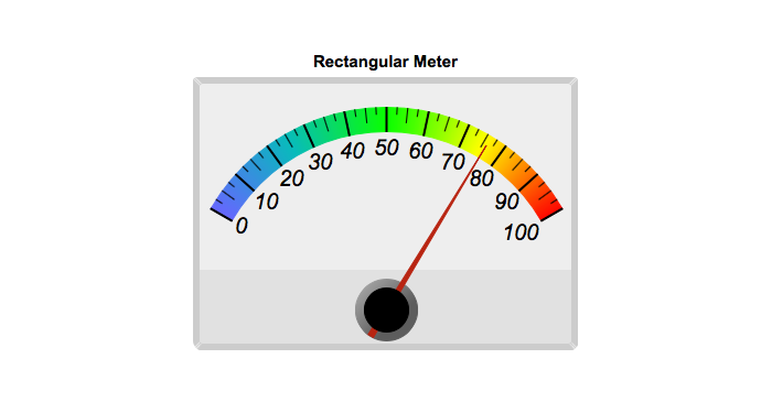 | Yes | ||
| Donut Percent | Donutpercent | Meter | 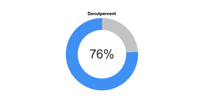 | Yes | Yes | |
| Semi-Donut Percent | Semidonutpercent | Meter | 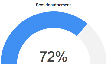 | Yes | ||
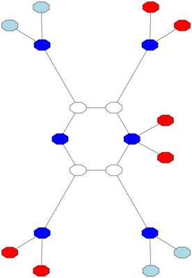
| Hierarchy | Hierarchy | Network | 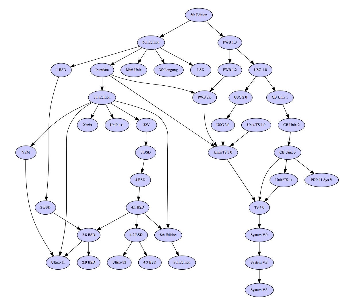 | Yes | ||
| Network | Network | Network | 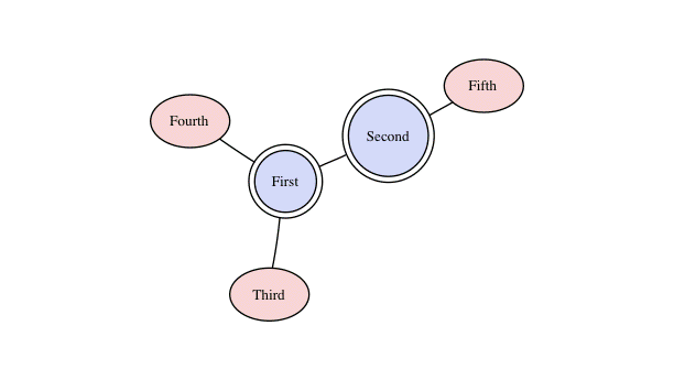 | Yes | ||
| Gantt | Gantt | Gantt | 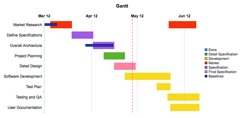 | Yes | ||
| Polar Area | PolarArea | MS | 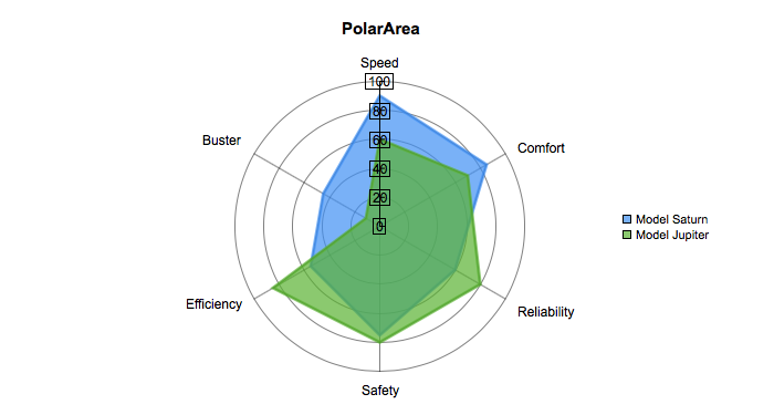 | Yes | ||
| Polar Line | PolarLine | MS | 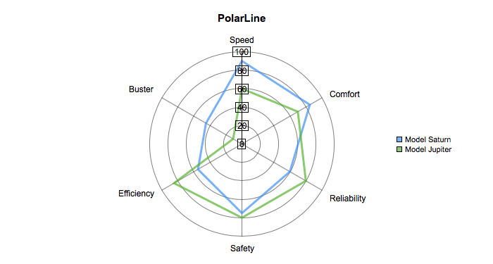 | Yes | ||
| Polar Spline | PolarSpline | MS | 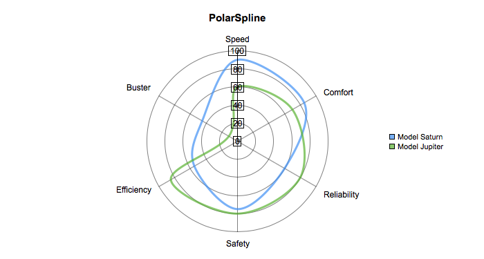 | Yes | ||
| Polar Spline Area | PolarSplineArea | MS | 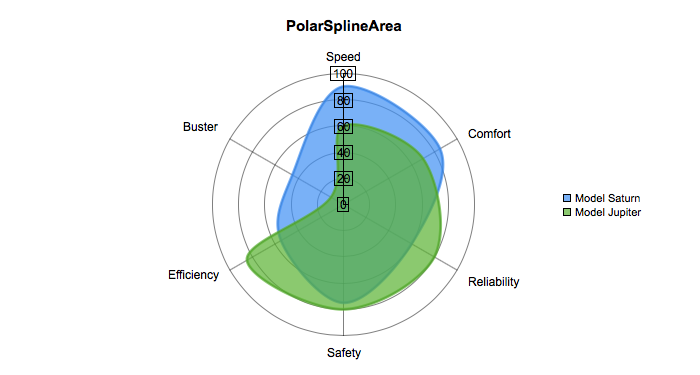 | Yes | ||
| Polar Scatter | PolarScatter | MS | 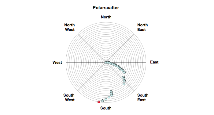 | Yes | ||
| Radar Area | RadarArea | MS | 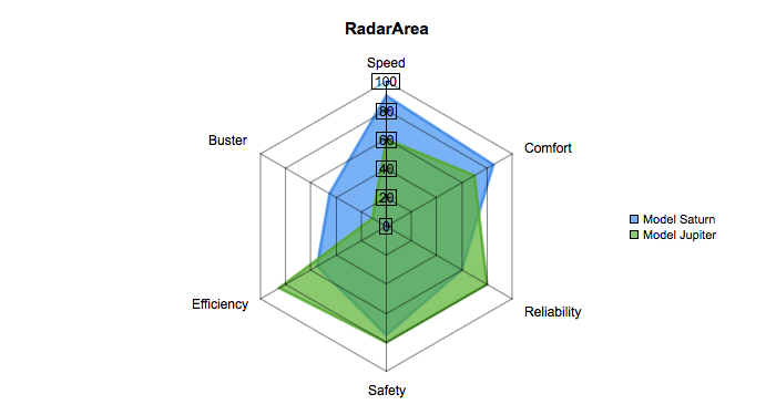 | Yes | ||
| Radar Line | RadarLine | MS | 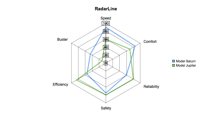 | Yes | ||
| Radar Spline | RadarSpline | MS | 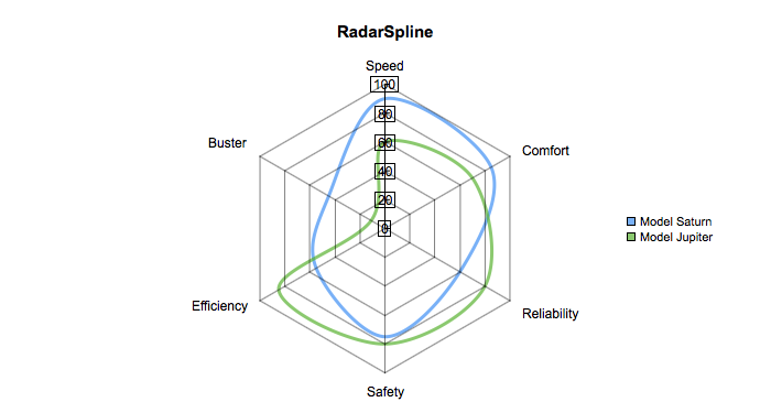 | Yes | ||
| Radar Spline Area | RadarSplineArea | MS | 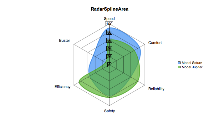 | Yes | ||
| Rose | Rose | XY |  | Yes | ||
| Boxwhisker | Boxwhisker | Other | 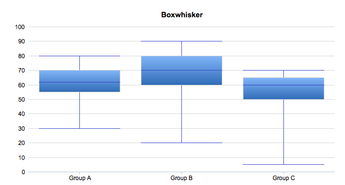 | Yes | ||
| Floatingbox | Floatingbox | Other | 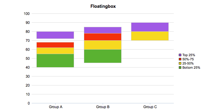 | Yes | ||
| Scatter3D | Scatter3D | Other |  | Yes | ||
| MSScatter3D | MSScatter3D | Other | 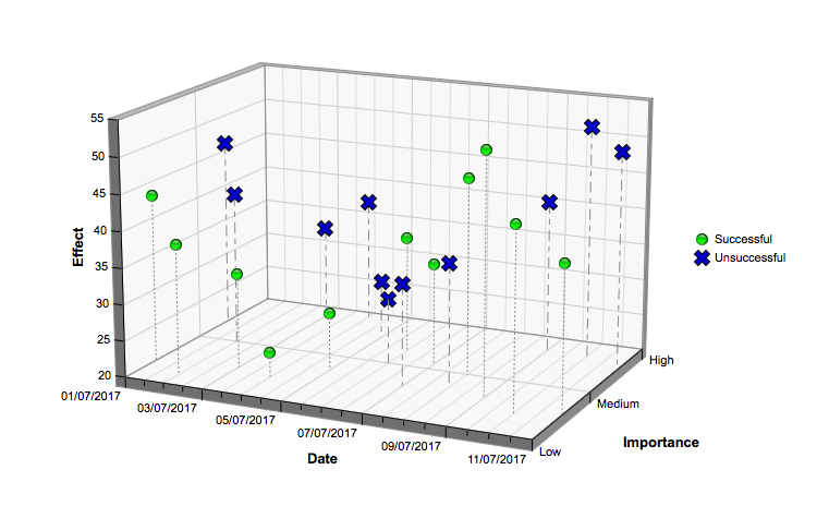 | Yes |
How to Create a Chart?
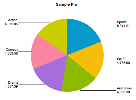
To create a chart, you need to select the chart type and then fetch the appropriate data for the chart. Here is an example of generating a sample pie chart.
select 'dbr.chart', 'Pie', 'Sample Pie chart';

select category, total_sales
from mydb.sales_by_film_category;
Selecting Data for the Chart
Depending on the selected chart type, the data must be selected accordingly:
XY Chart
For XY-charts, use the following data selection:
select X, Y
from mydb.Data;
Multi-series Chart
For multi-series charts (MS), use the following data selection:
select Series (x), Category (label), Value (y)
from mydb.Data;
Scatter Chart
For a scatter chart, use the following data selection:
select Series, x, y
from mydb.Data;
ScatterLine Chart
For a scatterline chart, use the following data selection:
select Series, x, y, 'scatter' | 'line'
from mydb.Data;
Boxwhisker Chart
For a boxwhisker chart, use the following data selection:
select Series, bottom, top, [min, [max, [middle]]]
from mydb.Data;
Scatter3D Chart
For a Scatter3D chart, use the following data selection:
select x, y, z
from mydb.Data;
MSScatter3D Chart
For a MSScatter3D chart, use the following data selection:
select Series, x, y, z
from mydb.Data;
Meter Chart
For meter charts, simply select the data value.
select 'dbr.chart', 'meter';

select  78;
Network Chart
For network charts there are two options:
Option 1 where the chart is drawn based on single values/node.
select node1, node2 [, edge_style]
from mydb.Data;
Option 2 where node contains both an ID value and the visible value to the user. This can be used when making charts to be exported and you want to keep the IDs.
select node1_id, node2_id, node1_name, node2_name [, edge_style]
from mydb.Data;
Network charts are generated using Graphviz technology and Graphviz formatting can be applied to the charts using the 'dbr.chart.options'-command. The option can be separately set to nodes (is a parent) and leaves (is only a child). The options are set as a comma-separated list and can contain all the formatting supported by Graphviz.
select 'dbr.chart.gv.style', 'node', 'shape=house,fillcolor=#CCCCFF,style=filled';
Gantt Chart
A Gantt chart has a label, starttime, and endtime, with an optional category
select 'dbr.chart', 'gantt';

select  label, starttime, endtime [, category]
from data;
Creating Responsive Charts
With responsive charts, the image map automatically resizes with the chart so that the tooltips stay in place. This works best with SVG charts which can scale well.
-- Make the chart fill the element it is attached to
select 'dbr.chart', 'bar', 'Bar Chart', '100%', '100%';
select 'dbr.resultclass', 'responsive';

-- If the SVG chart is not the default chart
-- select 'dbr.chart.options', 'format', 'svg';

select label, value
from data;
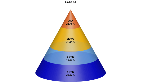
Setting Custom Chart Colors
Default colors are defined in the defaults.php file. If you wish to change the default colors, you can edit the file to include your colors. Alternatively, you can use the 'dbr.chart.color' command to override the default colors. If you want to override the default colors and use the same definition in multiple reports, the easiest way to do this is to place the command in a separate stored procedure and call the procedure from your report.
We'll first define the procedure containing the colors (you can call 'dbr.chart.color' multiple times):
create procedure sp_ADBR_MyColors()
begin

select 'dbr.chart.color', '0x300000cc', '0x4066aaee', '0x40ffbb00', '0x40ee6622';

end
And then use it in a report:
call sp_ADBR_MyColors();

select 'dbr.chart', 'Cone3d', 'Cone3d';

select 'Funds', 156
union
select 'Bonds', 123
union
select 'Stocks', 211
union
select 'Cash', 179;
And the chart will use the colors you defined:
Sparkline Charts
Sparkline charts are often used to present trends and variations, such as stock prices and temperature.
Sparkline Charts in myDBR
Sparkline charts in myDBR utilize Gareth Watts' jQuery Sparklines plugin originally developed for Splunk Inc. All features available in the plugin are accessible in myDBR.
To use sparklines, the data column needs to have a comma-separated list of values in a single column. In the example, this is achieved using MySQL's GROUP_CONCAT function. Then, a CSS class is added to the column so that a jQuery call can reference it. The plugin is invoked with parameters using the dbr.javascript command. The 'onload' parameter for dbr.javascript ensures the jQuery plugin executes after the DOM tree has been created.
select 'dbr.hidecolumns', 1;

select 'dbr.colclass', 'Spark', 'spark';

select 'Sales', group_concat(s) as 'Spark', 'pie'
from (
select quarter(InsertDate) as q, sum(ItemsSold) as s
from TestTable
where year(InsertDate)=2008
group by 1
) sub;

select 'dbr.javascript', "$('.spark').sparkline('html', { type: 'pie', height: '1.0em' });", 'onload';

Chart Examples
Basic XY Chart
In this example, we'll generate a simple pie chart. Like any other XY-chart, we need to provide X and Y values for the chart.
select 'dbr.chart', 'Pie', 'Sample Pie chart';

select category, total_sales
from mydb.sales_by_film_category;
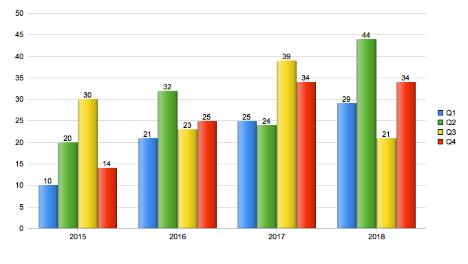
A Multi-Series Column Chart
In multi-series charts, we have multiple Y-values. In the following example, we'll select data for each quarter for selected years and create a multi-series column chart from the data.
select 'dbr.chart', 'mscolumn';
select 'dbr.chart.options', 'showValues', 1;

select production_year, production_quarter, value
from mydata;
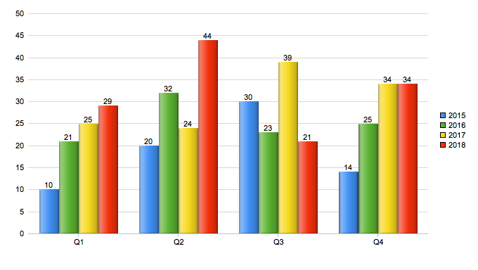
Transposing a Multi-Series Column Chart
Multi-series charts can easily be transposed so that the categories and the series swap places. We'll use the same query as in the previous example, and we'll transpose the chart before displaying it. This is done using the chart option 'chart_transpose'.
select 'dbr.chart', 'mscolumn';
select 'dbr.chart.options', 'showValues', 1;
select 'dbr.chart.options', 'chart_transpose';

select production_year, production_quarter, value
from mydata;
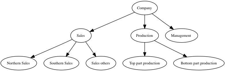
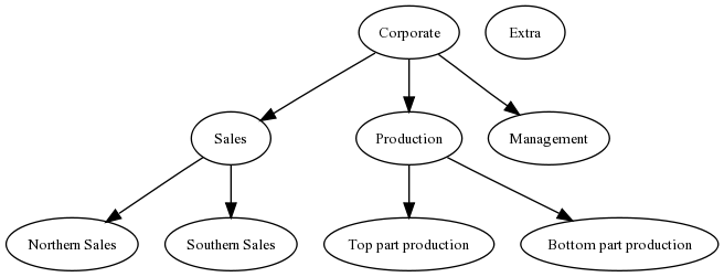
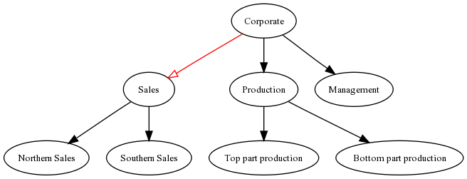
Hierarchical Chart
Hierarchical and diagram charts both produce network charts. In a hierarchical chart, there is a parent-child connection, whereas in diagram charts, there is a connection between the nodes. Both charts are generated in the same way, with the only difference being the chart type.
select 'dbr.chart', 'Hierarchy';

select 'Corporate', 'Sales'
union
select 'Corporate', 'Production'
union
select 'Corporate', 'Management'
union
select 'Sales', 'Northern Sales'
union
select 'Sales', 'Southern Sales'
union
select 'Production', 'Top part production'
union
select 'Production', 'Bottom part production';
Network Chart Options
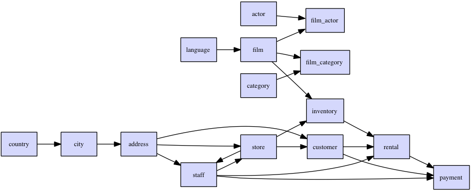
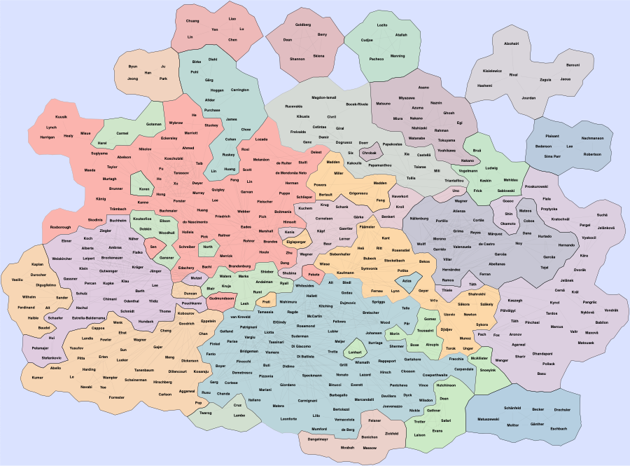
The example queries MySQL's sakila-demo database system tables to create a quick ER-diagram. The chart is a Hierarchy chart, and with the diagram option, the chart is set to Left-to-Right (see Graphviz documentation for more info).
select 'dbr.chart', 'Hierarchy';
select 'dbr.chart.gv.style', 'graph', 'rankdir=LR';
select 'dbr.chart.gv.style', 'node', 'shape=box,fillcolor=#CCCCFF,style=filled';

select distinct referenced_table_name, table_name
from information_schema.key_column_usage
where table_schema='sakila' and referenced_table_name is not null
order by referenced_table_name;
Boxwhisker Chart
The boxwhisker chart consists of the bottom and top values. Optionally, you can add minimum, maximum, and middle values.
select 'dbr.chart', 'Hierarchy';
select 'dbr.chart.gv.style', 'graph', 'rankdir=LR';
select 'dbr.chart.gv.style', 'node', 'shape=box,fillcolor=#CCCCFF,style=filled';

select label, box_min, box_max, minim, maxim, middle
from mydb.data;

Floating Box
A floating box chart is a variation of a box-and-whisker chart that draws independent boxes for each series or label with minimum and maximum values.
select 'dbr.chart', 'floatingbox', 'floatingbox';

select series, label, box_min, box_max
from mydb.data;

3D Bubble Chart
A sample bubble chart with options
declare vTechA varchar(30);
declare vTechB varchar(30);
declare vTechC varchar(30);

select 'dbr.chart', 'bubble3d', '3D Bubble chart', 612, 345;
select 'dbr.chart.options', 'bubble.scale', 'y';

select 'dbr.chart.color', '0x00FF00', '0xFF0000','0x0000FF';

set vTechA = 'Techology A';
set vTechB = 'Techology B';
set vTechC = 'Techology C';

select 150 as 'x', 12 as 'y', 20 as 'r', vTechA as 'name', 'x1' as 'rn'
union
select 30, 60, 50, vTechA, 'x2'
union
select 300, 25, 50, vTechA, 'x3'
union
select 240, 125, 165, vTechA, 'x4'
union
select 50, 35, 30, vTechB, 'x5'
union
select 100, 50, 55, vTechB, 'x6'
union
select 130, 175, 95, vTechC, 'x7';
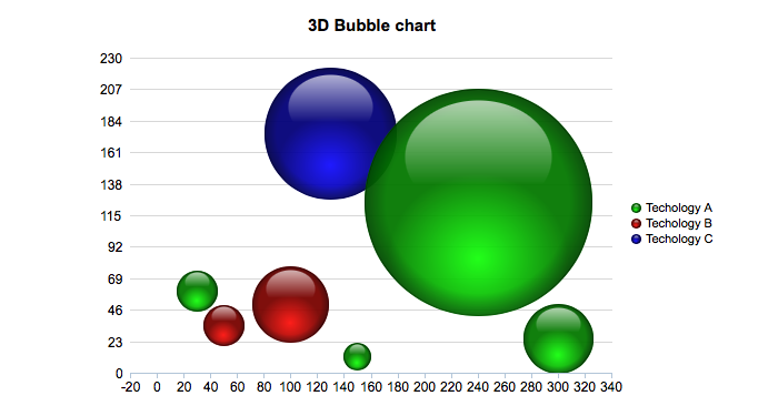
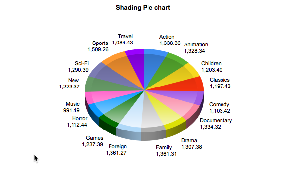
Chart Shading
With the shading option you can use ChartDirector's chart shading feature:
select 'dbr.chart', 'Pie3D', 'Shading Pie chart';
select 'dbr.chart.options', 'shading', 'ConcaveShading';
select 'dbr.chart.options', 'pie_label_format', '0';

select category, total_sales
from mydb.sales_by_film_category;
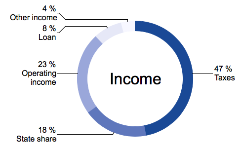
Donut Chart With Options
A donut-chart (or you can use alias 'doughnut'), with options
select 'dbr.chart', 'donut', '', 550, 350;

/* Set the donut thickness */
select 'dbr.chart.options', 'donut.size', 20;
/* Text in the middle */
select 'dbr.chart.options', 'donut.text', 'Income';
/* Font size of the text in the middle */
select 'dbr.chart.options', 'donut.font.size', 24;
/* Label font sizes */
select 'dbr.chart.options', 'label_font_size', 12;

select 'dbr.chart.color', '0x194996', '0x5F77BC', '0x9AA7DA', '0xE6E8F7', '0xF7F7FF';
select 'dbr.colstyle', 'Percentage', '{value} %\n{label}';

select Sector, Percentage
from mydb.income;
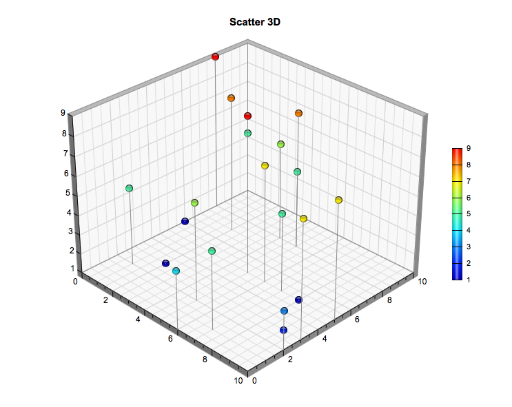
Scatter3D Chart
A basic scatter chart includes x, y, and z data.
select 'dbr.chart', 'scatter3d';

select x, y, z
from scatter_3d;
MSScatter3D Chart With Options
A scatter3D chart has multiple options so you can fine-tune the chart to suit your needs.
/* A scatter chart with multiple options */
select 'dbr.chart', 'msscatter3d', '', 760, 440;

select 'dbr.chart.options', 'axis', 'Date', 'Importance', 'Effect';
select 'dbr.chart.options', 'marker', 'Unsuccessful', 'Cross2Shape()', 15;
select 'dbr.chart.options', 'scatter3d.y_axis_labels', "Low", "Medium", "High";

select 'dbr.chart.color', '0x00ff00', '0x0000cc';

select 'dbr.chart.options', 'scatter3d.plot_area', 385, 210, 400, 280, 240;
select 'dbr.chart.options', 'scatter3d.view_angle', 15, 25;

select 'dbr.chart.options', 'axis_font' ,'arialbd.ttf';
select 'dbr.chart.options', 'axis_font_size' , 10;

select 'dbr.chart.options', 'label_font_size', 8;

select 'dbr.chart.options', 'scatter3d.drop_line', 'Successful', null, 'dot';
select 'dbr.chart.options', 'scatter3d.drop_line', 'Unsuccessful', '0x0000cc', 'altdash';

select label, x, y, z
from msscatter_3d;

Basic Gantt Chart
In the most basic Gantt chart, we have labels with start and end dates.
select 'dbr.chart', 'gantt', 'Gantt';

select label, cast(start as date), cast(end as date)
from (
  select 'Market Research' as 'label', '2017-03-16' as 'start', '2017-03-30' as 'end', 'Market' as 'stage'
  union
  select 'Market Research', '2017-06-02', '2017-06-20', 'Market'
  union
  select 'Define Specifications', '2017-03-30', '2017-04-13', 'Specification'
  union
  select 'Overall Archiecture', '2017-04-13', '2017-04-27', 'Specification'
  union
  select 'Project Planning', '2017-04-20', '2017-05-04', 'Detail Specification'
  union
  select 'Detail Design', '2017-04-27', '2017-05-11', 'Final Specification'
  union
  select 'Software Development', '2017-05-04', '2017-06-03', 'Development'
  union
  select 'Test Plan', '2017-05-25', '2017-06-03', 'Development'
  union
  select 'Testing and QA', '2017-06-01', '2017-06-22', 'Development'
  union
  select 'User Documentation', '2017-06-03', '2017-06-22', 'Development'
 ) as q;
Gantt Chart Within a Day
If your Gantt chart data covers only a day, the x-axis shows hours. You can set the scale with the gantt.start and gantt.end options.
select 'dbr.chart', 'gantt', 'Gantt hours', 600, 150;
select 'dbr.chart.options', 'gantt.scale', 1;
select 'dbr.chart.options','gantt.start', '2000-01-01 06:00:00';
select 'dbr.chart.options','gantt.end', '2000-01-01 21:00:00';

select label, cast(concat('2000-01-01 ',start) as datetime), cast(concat('2000-01-01 ',end) as datetime)
from (
  select 'Breakfast' as 'label', '07:00' as 'start', '07:20' as 'end'
  union
  select 'Lunch', '11:00', '10:30'
  union
  select 'Dinner', '17:45', '18:30'
 ) as q;

Gantt Chart with Options
A Gantt chart has many options that you can use to configure it.
select 'dbr.chart', 'gantt', 'Gantt with options', 800, 'auto';

select 'dbr.chart.options', 'category_order', 'Extra', 'Detail Specification';
select 'dbr.chart.options', 'category_order', 'Development';
select 'dbr.chart.options','gantt.baseline_text', 'Baseline text';
select 'dbr.chart.options','gantt.baseline_pattern.border', '0x000000'; /* Show no border for baseline bars */
select 'dbr.chart.options','gantt.baseline_pattern.color', '0x1B32C4'; /* Show baseline bars in dark blue */
select 'dbr.chart.options', 'gantt.start_of_day_format', '-{value|dd}'; /* Show dates as "Monthname dd" */
select 'dbr.chart.options','gantt.baseline', 'Market Research', '2017-03-12', '2017-03-20' /* Add baseline bars */
union
select 'dbr.chart.options','gantt.baseline', 'Overall Archiecture', '2017-04-08', '2017-04-26';
select 'dbr.chart.options', 'gantt.dateline', '2017-05-09'; /* Add vertical bar */
select 'dbr.chart.options', 'gantt.scale', 30; /* x-axis per month */
select 'dbr.chart.options','height_per_item', 30;

select label, cast(start as date), cast(end as date), stage
from (
  select 'Market Research' as 'label', '2017-03-16' as 'start', '2017-03-30' as 'end', 'Market' as 'stage'
  union
  select 'Market Research', '2017-06-02', '2017-06-20', 'Market'
  union
  select 'Define Specifications', '2017-03-30', '2017-04-13', 'Specification'
  union
  select 'Overall Archiecture', '2017-04-13', '2017-04-27', 'Specification'
  union
  select 'Project Planning', '2017-04-20', '2017-05-04', 'Detail Specification'
  union
  select 'Detail Design', '2017-04-27', '2017-05-11', 'Final Specification'
  union
  select 'Software Development', '2017-05-04', '2017-06-03', 'Development'
  union
  select 'Test Plan', '2017-05-25', '2017-06-03', 'Development'
  union
  select 'Testing and QA', '2017-06-01', '2017-06-22', 'Development'
  union
  select 'User Documentation', '2017-06-03', '2017-06-22', 'Development'
 ) as q;

Meter Charts
myDBR offers various types of meter charts (charts that display one value on a scale): circle meter, semicircle, rectangular, and linear meter. All share the same logic and options.
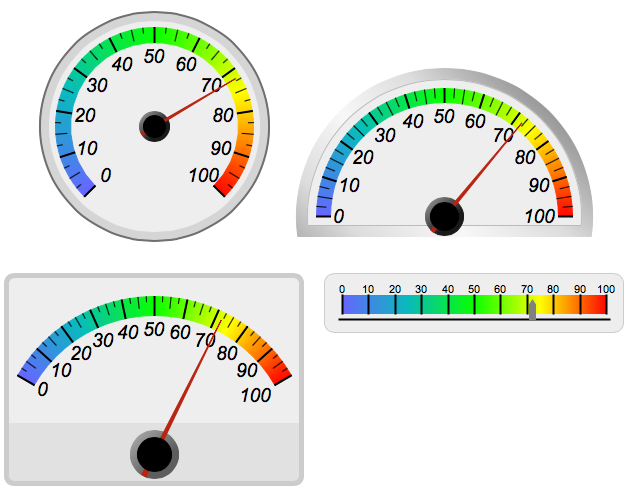
Formatting Options for Meter Charts
You can format various parts of meter charts
- Choose between step and gradient coloring
- Define coloring scale (start and steps)
- Define number scale
- Add texts
- Choose between themes
- Set font, font size, and font colors for both title and label
- Choose pointer color
Setting Steps and Gradient Colors
You can choose between step and gradient colors.
Using step colors and custom color scales
select 'dbr.chart','meter';

/* Use step colors */
select 'dbr.chart.options', 'meter.color.type', 'step';

/* First step represents where the coloring starts, subsequent steps define next step and used color */
select 'dbr.chart.options', 'meter.color.step', step, color
from (
  select 10 as 'step', null as 'color'
  union
  select 40, '0xFFFF00'
  union
  select 70, '0x00FF00'
  union
  select 100, '0xFF0000'
) as q;

select 60;
Using gradient colors and custom color scales
select 'dbr.chart','meter';

/* Use of gradient colors is done by default, you can also define the color type to gradient*/
select 'dbr.chart.options', 'meter.color.type', 'gradient';

/* Use custom scale min, max, step */
select 'dbr.chart.options', 'scale', 20, 180, 20;

/* Choose white theme */
select 'dbr.chart.options', 'meter.theme', 'white';

/* Set gradient steps */
select 'dbr.chart.options', 'meter.color.gradient', step, color
from (
select 20 as 'step', '0xd3d3d3' as 'color'
union
select 40, '0xd3d3d3'
union
select 100, '0xa9a9a9'
union
select 180, '0x000000'
) as q;

select 60;
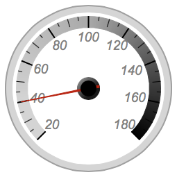
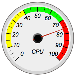
Choosing Meter Theme
Meter themes (defined in defaults.php: default, white, black) allow for defining various aspects of a chart.
Using the black theme and setting text
select 'dbr.chart','rectangularmeter';

select 'dbr.chart.options', 'meter.text', 'CPU';
select 'dbr.chart.options', 'meter.theme', 'black';
select 'dbr.chart.options', 'scale', 20, 200, 20;

select 'dbr.chart','meter';

select 40;
Vertical Linearmeter
You can set the linearmeter to be vertical
select 'dbr.chart','linearmeter';

select 'dbr.chart.options', 'linearmeter.orientation', 'vertical';

select 76;

Chart.js Charts
![]()
Chart.js chart module provides flexible, animated, interactive, and responsive charts. See more info at Chart.js website.
Chart.js shares the same configuration as other charts. To choose Chart.js as the chart engine, include the Chart.js extension in the report and use the configuration select 'dbr.chart.options', 'chartjs'.
Available chart types are:
- Pie
- Bar
- Column
- Line/Spline - both produce same result
- Area
- Doughnut/Donut - both produce same result
- MSline
- MScolumn
- StackedArea
- MSbar
- Radar
- RadarLine
- Scatter
- StackedColumn
- StackedBar
- ScatterLine
- DonutPercent/DoughnutPercent
The following chart options are available for Chart.js-based charts:
area.line.width width
Line width in area chartarea.line.color color
Line color in area chartarea.opacity opacity
Opacity of the area in area chartlegend.position 'left' \| 'right' \| 'bottom' \| 'top'
Position of the legendshowvalues, 1 \| 0marker, size
Set marker size for scatter chartchartjs.color
Set default ChartJS text colorchartjs.backgroundColor
Set default ChartJS background color`chartjs.borderColor
Set default ChartJS border colorscale
Set axis scalescale_y
Set y-axis scalechartjs.dataset
Allow to set native Chart.js dataset optionschartjs.color
Set the Chart.defaults.color in hexchartjs.fontColor
Set the Chart.defaults.colorchartjs.backgroundColor
Set the Chart.defaults.backgroundColorchartjs.borderColor
Set the Chart.defaults.borderColorchartjs.arcBorderColor
Set the Chart.defaults.elements.arc.borderColorchartjs.arcBorderColor
Set the Chart.defaults.elements.arc.borderColordonutpercent.text
Set the text for donutpercentchartjs.dataset.datalabels
Set the text for chartjs.dataset.datalabelsdatetimescale
Set the axis to be date
See myDBR Demo for sample charts.
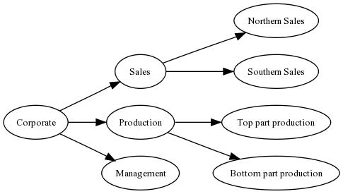
Hierarchical and Diagram Charts - Using Graphviz
myDBR's Graphviz Basics
Nodes represent the connected elements in Graphviz. If no node definitions are given, the chart with nodes is drawn with default Graphviz formatting.
In Graphviz charts, there are two options for the data query:
Option 1 involves drawing the chart based on single values/nodes.
select node1, node2 [, edge_style]
from mydb.Data;
Option 2 involves nodes containing both an ID value and a visible value to the user. This can be used when creating charts for export purposes, where retaining the IDs is necessary.
select node1_id, node2_id, node1_name, node2_name [, edge_style]
from mydb.Data;
Here is a simple example of a hierarchical chart.
select 'dbr.chart', 'Hierarchy';

select 'Corporate', 'Sales'
union
select 'Corporate', 'Production'
union
select 'Corporate', 'Management'
union
select 'Sales', 'Northern Sales'
union
select 'Sales', 'Southern Sales'
union
select 'Production', 'Top part production'
union
select 'Production', 'Bottom part production'
union
select 'Extra', null;
Graphviz Graph
Formatting needed for the Graphviz graph can be passed through the dbr.chart.gv.style command.
select 'dbr.chart.gv.style', 'graph', style_definition;
select 'dbr.chart', 'Hierarchy';
select 'dbr.chart.gv.style', 'graph', 'rankdir=LR,splines=false';

select 'Corporate', 'Sales'
union
select 'Corporate', 'Production'
union
select 'Corporate', 'Management'
union
select 'Sales', 'Northern Sales'
union
select 'Sales', 'Southern Sales'
union
select 'Production', 'Top part production'
union
select 'Production', 'Bottom part production';
Node
The nodes can all be formatted with the same style, or specific formatting can be applied to individual nodes. In the next example, we'll change the default formatting and format selected nodes individually.
select 'dbr.chart.gv.node', nodeID, name, style_definition[, clusterID]
The style_definition is a comma-separated list of Graphviz-attributes.
select 'dbr.chart', 'Hierarchy';

/* This will change the default node formatting */

select 'dbr.chart.gv.style', 'node', 'shape=box,fillcolor=#CCCCFF,style=filled';
/* This will change formatting from individual nodes */

select 'dbr.chart.gv.node', 'Sales', 'Sales', 'shape=box3d,fillcolor=red,style=filled';
select 'dbr.chart.gv.node', 'Production', 'Production', 'shape=box3d,fillcolor=red,color=white,style=filled';

select 'Corporate', 'Sales'
union
select 'Corporate', 'Production'
union
select 'Corporate', 'Management'
union
select 'Sales', 'Northern Sales'
union
select 'Sales', 'Southern Sales'
union
select 'Production', 'Top part production'
union
select 'Production', 'Bottom part production';

Subgraph/Cluster
Adding clusters to the chart can be done using the 'dbr.chart.gv.cluster' command. In addition to the cluster itself, the nodes attached to the cluster also need to be defined.
select 'dbr.chart.gv.cluster', clusterID, name, style_definition
select 'dbr.chart', 'Hierarchy';
select 'dbr.chart.gv.style', 'graph', 'rankdir=TB,splines=true,ranksep=0.8';
select 'dbr.chart.gv.style', 'node', 'shape=box,fillcolor=#CCCCFF,style=filled,fontsize=10';

select 'dbr.chart.gv.node', 'Sales', 'Sales', 'shape=box,fillcolor=red,fontcolor=white,style="rounded,filled",fontsize=10', 1;
select 'dbr.chart.gv.node', 'Production', 'Production', 'shape=box,fillcolor=red,fontcolor=white,style="rounded,filled",fontsize=10', 1;

select 'dbr.chart.gv.cluster', 1, 'Organization', 'style=filled,fillcolor=lightgrey,labelloc=b,fontsize=12';

select 'Corporate', 'Sales'
union
select 'Corporate', 'Production'
union
select 'Corporate', 'Management'
union
select 'Sales', 'Northern Sales'
union
select 'Sales', 'Southern Sales'
union
select 'Production', 'Top part production'
union
select 'Production', 'Bottom part production';

Edge
Passing formatting information to edges can be accomplished by adding the style information to the node query.
select 'dbr.chart', 'Hierarchy';

select 'Corporate', 'Sales', 'color=red,arrowhead=empty'
union
select 'Corporate', 'Production', ''
union
select 'Corporate', 'Management', ''
union
select 'Sales', 'Northern Sales', ''
union
select 'Sales', 'Southern Sales', ''
union
select 'Production', 'Top part production', ''
union
select 'Production', 'Bottom part production', '';
Layout Engine
myDBR allows you to select the layout engine used by using the command dbr.chart.gv.engine. Refer to the Graphviz documentation for more information on layout engines and how to choose the most suitable one for your chart.
select 'dbr.chart.gv.engine', engine
Possible engines:
- dot - makes 'hierarchical' or layered drawings of directed graphs (default engine)
- neato - makes 'spring model' layouts (Kamada-Kawai algorithm)
- fdp - makes 'spring model' layouts (Fruchterman-Reingold algorithm)
- twopi - makes radial layout after Graham Wills 97
- circo - makes circular layout, after Six and Tollis 99, Kauffman and Wiese 02
Example of engine usage:
declare vShape varchar(100)

/* Make it a network chart */

select 'dbr.chart', 'network';

/* Use the neato engine */

select 'dbr.chart.gv.engine', 'neato';

/* Prepare the shape, we'll get the color from the data */

select 'shape=octagon,style=filled,fillcolor=' into vShape;

/* Set individual node's color, no label */

select 'dbr.chart.gv.node', id, null, concat(vShape, color)
from mydb.nodes;

/* Get the chart data */

select parent, child
from mydb.node_connections;
| circo engine | neato engine |
|---|---|
select 'dbr.chart.gv.engine', 'circo'; | select 'dbr.chart.gv.engine', 'neato'; |
 |  |
Example: Same chart drawn with different layout engines.
Using Preprocessor
The Graphviz file (gv-file) can be preprocessed. In this example, the file will be preprocessed with sfdp and gvmap. The $GV variable refers to the original gv-file. The preprocessed file will be piped to the renderer.
select 'dbr.chart', 'network', '', 1765, 1300;
select 'dbr.chart.gv.engine', 'neato';
select 'dbr.chart.gv.preprocess', 'sfdp -Goverlap=prism $GV |gvmap  -e';
select 'dbr.chart.gv.cmdoptions', '-Ecolor="#55555522" -n2';

select c.from_id, c.to_id, f.name, t.name
from gvmap_connections c
  join gvmap_nodes f on f.id=c.from_id
  join gvmap_nodes t on t.id=c.to_id
;
Notes: Report Linking and Graphviz Chart Size
Report linking (clicking a node launches another report) is also available for Graphviz charts. The report's parameters must always be bound to the first column.
select 'dbr.chart', 'network';
select 'dbr.report', 'sp_DBR_NodeZoom','vNodeID=1';

select parent, child
from mydb.node_connections;
If you want to scale the size of a Graphviz chart, you can use either the 'dbr.chart' command's x and y parameters or the native Graphviz scaling (see the size attribute). If both are applied, myDBR uses the size attribute.
select 'dbr.chart', 'network';
select 'dbr.chart.gv.style', 'graph', 'size="4,3"';
select 'dbr.report', 'sp_DBR_NodeZoom','vNodeID=1';

select parent, child
from mydb.node_connections;